Nexbuild
Asplan Viak's construction consultancy team relied on Nexbuild. The brief said "redesign the interface." After my first week with the product, I quietly rewrote the brief: figure out what to remove, and prove it's safe to remove it.
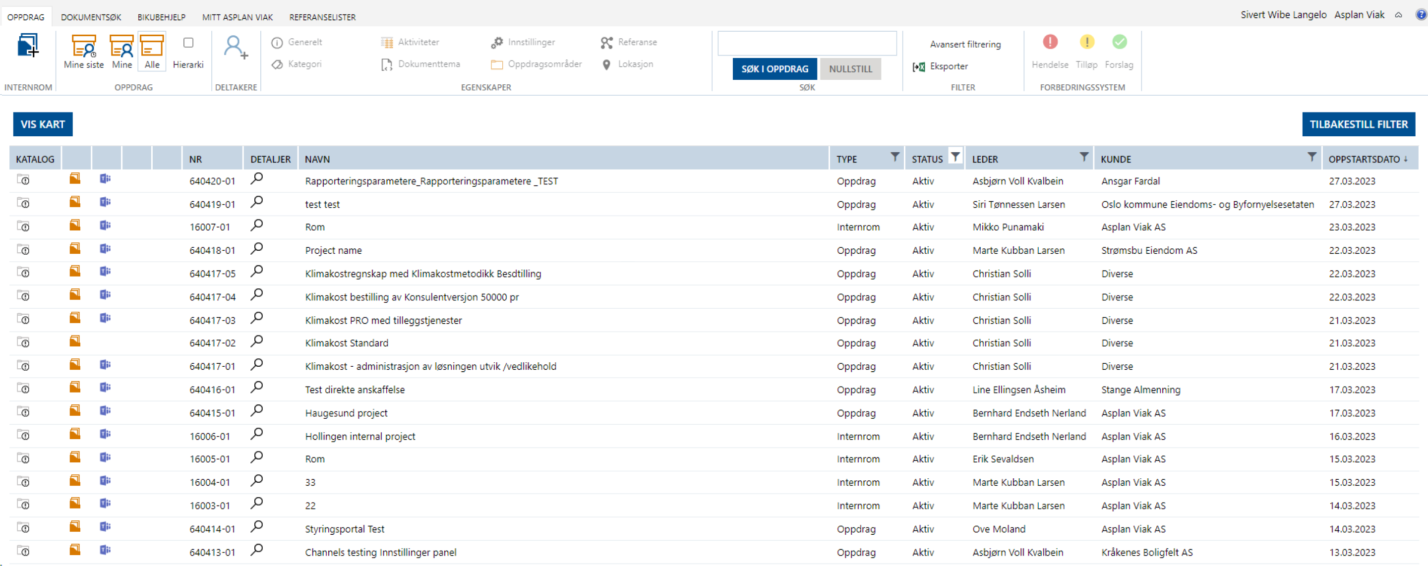
The old system was built like an Office ribbon. Five tabs on top and around 25 buttons visible at all times. Four different views of the same project list. Eight "property" buttons for every project. A search field with two separate reset buttons next to it - which tells you a lot about how much people trusted that search.
Experienced users had simply learned to ignore most of the screen. New employees needed weeks to stop asking their colleagues where things were.
I flew to Norway and sat next to the people who actually use the tool. Three things stayed with me:
- Experienced users don't read the interface - they remember it. They navigate by click paths built over years. Move things around carelessly and you break that.
- New people were lost for weeks. The ribbon gave no hint about what mattered.
- Many users were 45+, working in site offices with harsh daylight on their screens. Readability wasn't a "nice to have."
The entire interface was in Norwegian, and so was most of the conversation around it. It forced me to pay closer attention to how people actually interacted with the interface instead of relying on what they told me.
Before drawing anything, I put every single command from the old interface into a spreadsheet and asked: is this used daily, used inside a specific project, used rarely but critical, or just redundant?
Three destinations in the navigation - Assignments, Document search, Settings - and everything else moved into the context of a project.
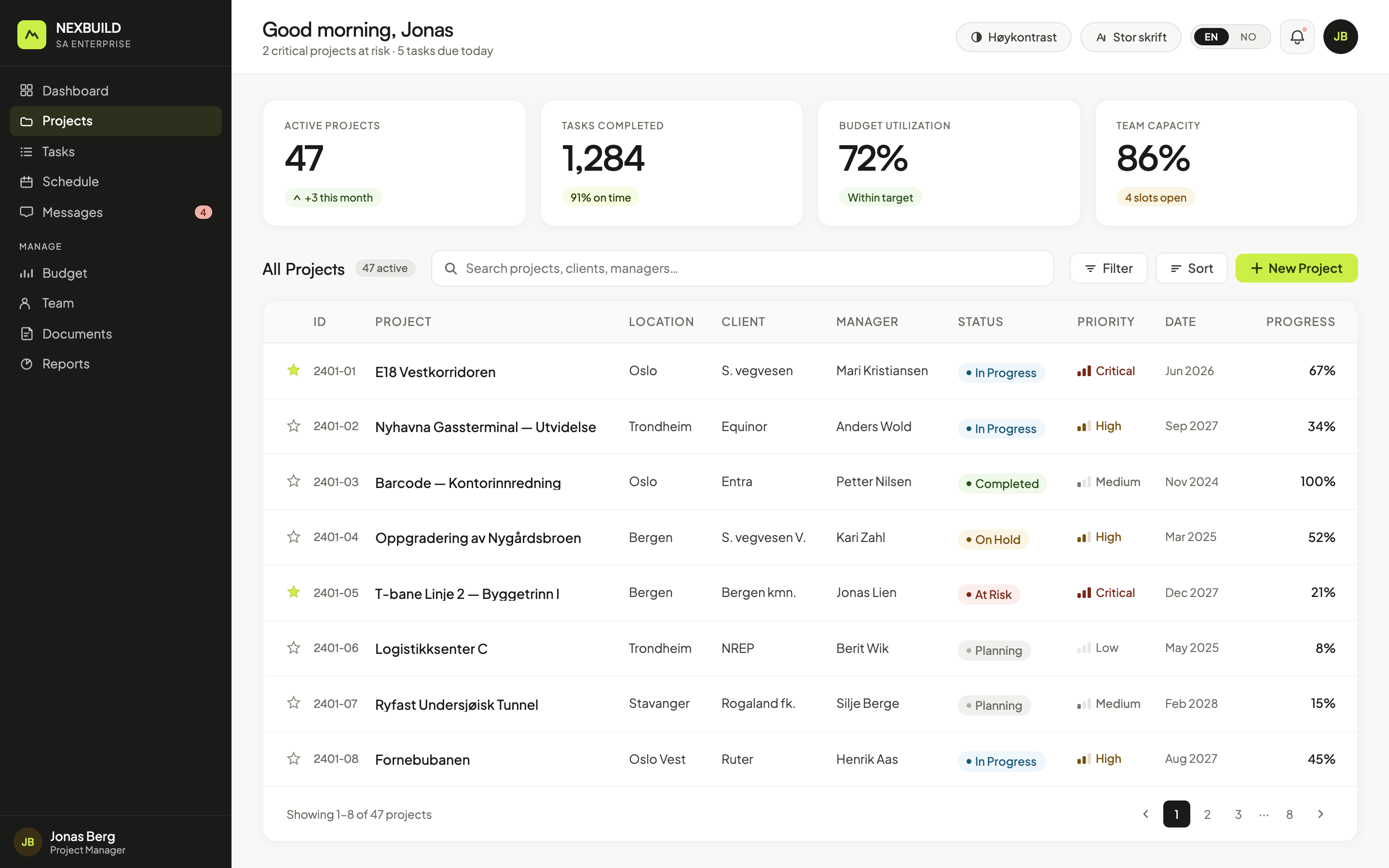
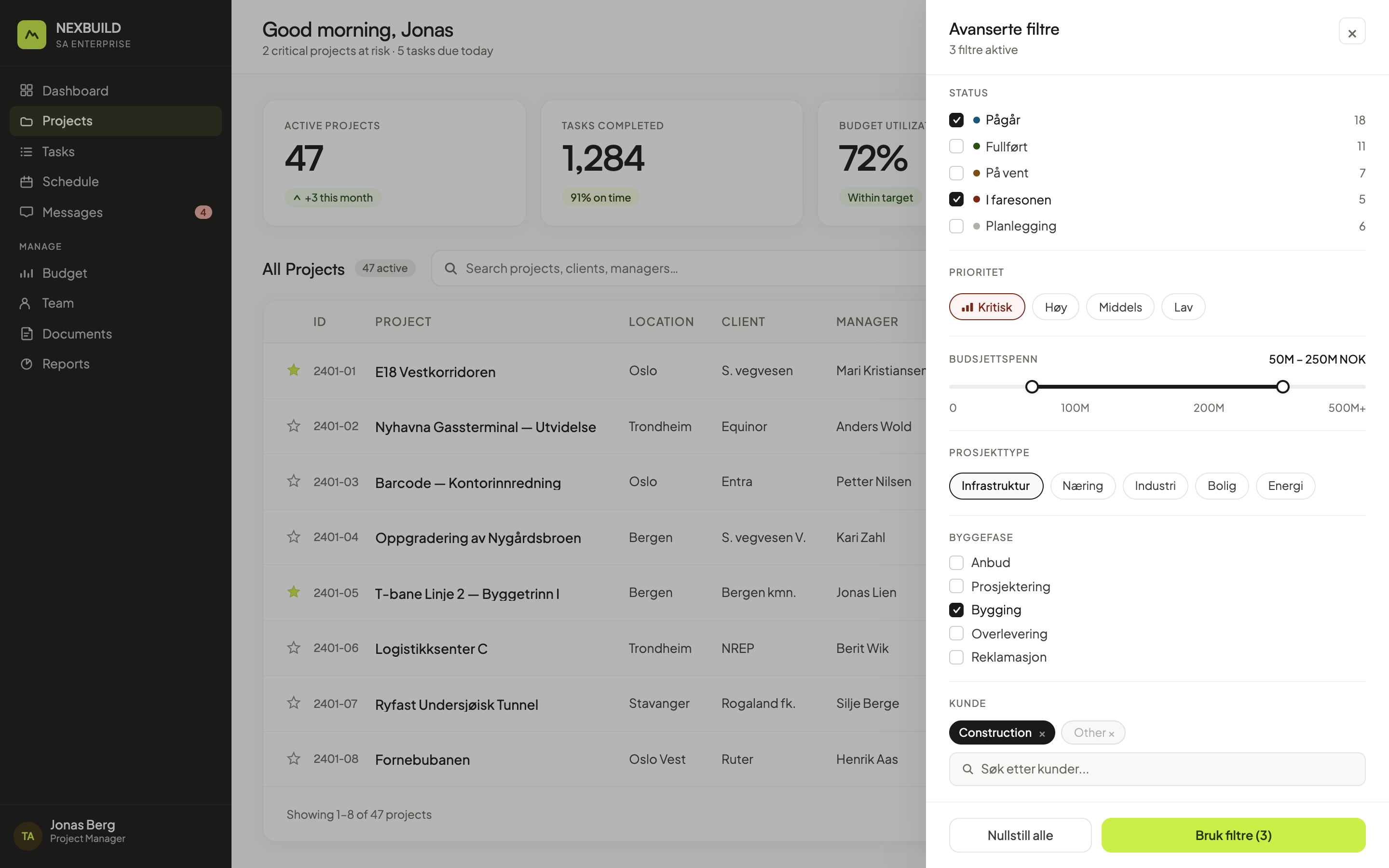
- Four list views became one list. A single search field that checks five things at once, plus visible status chips and a favourites star.
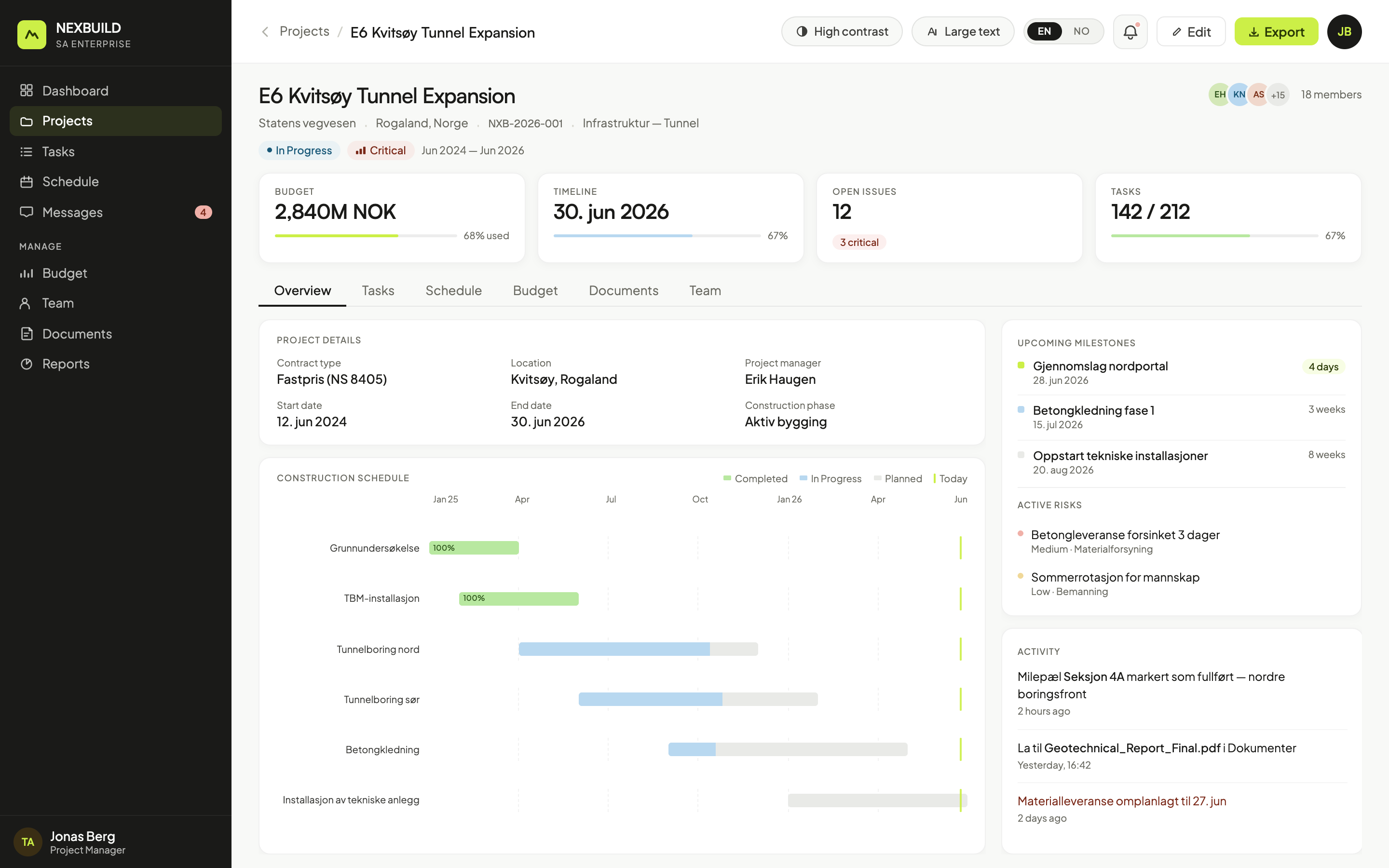
- Eight global property buttons became tabs inside the project - overview, participants, documents, activity log.
- Location got promoted. People say "the Bergen job", not the project number. So place became a first-class field.
- Manual project numbers are gone. The number generates itself.
Construction schedules are inherently sequential and overlapping - phases depend on each other and run in parallel - so a Gantt-style timeline was the only structure that could show that at a glance, rather than a list or table forcing users to reconstruct the sequence in their heads. Budget, milestones, and risk are pinned alongside it on the same tab, not behind a separate one, because none of them can be read in isolation: a delay only matters in relation to budget burn and an open risk.
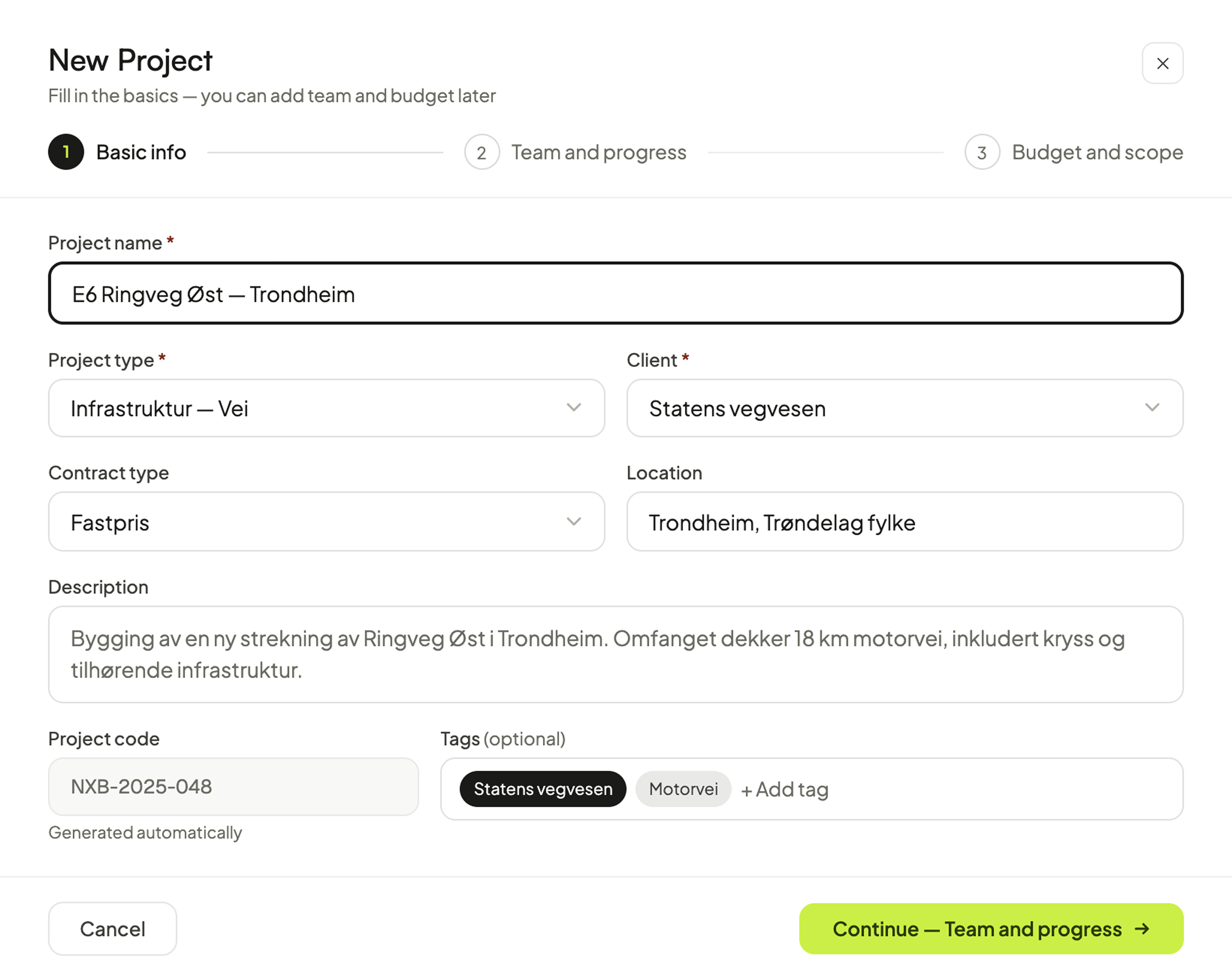
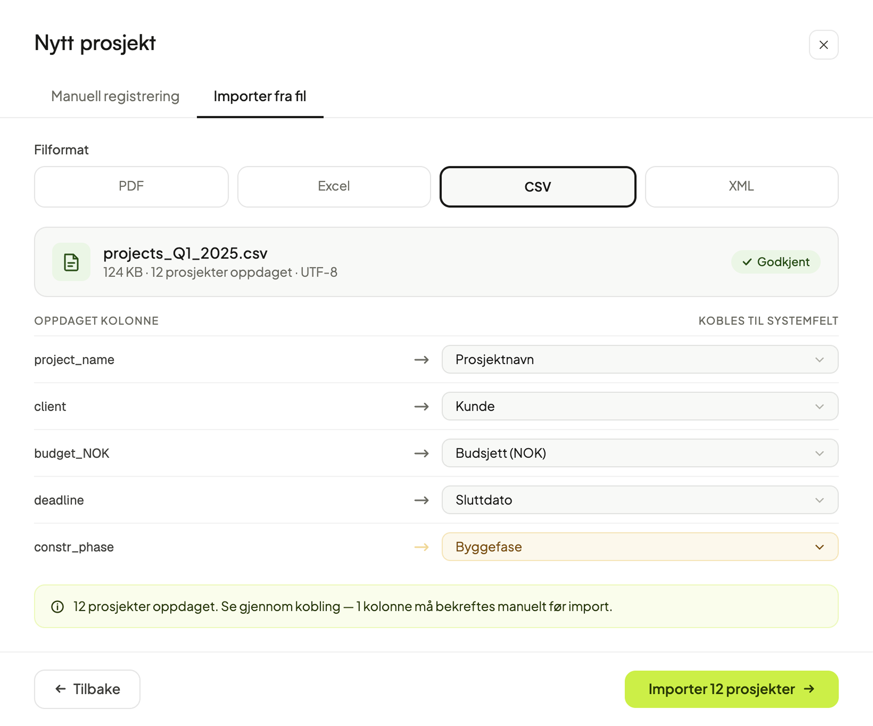
Most projects are created by hand through a short guided wizard - basics, team, budget - with the project code generating itself. For teams migrating existing spreadsheets, a CSV import maps columns to system fields automatically and flags anything it can't resolve on its own.
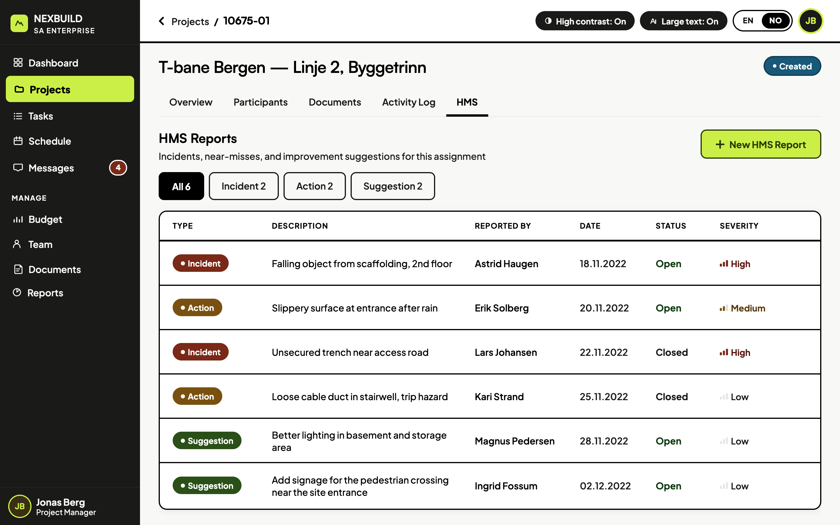
The usage numbers said this feature was dead. I only knew otherwise because I asked directly - HSE reporting of incidents, near-misses and suggestions is required by Norwegian law, which makes it critical regardless of how rarely it's used: cutting it wouldn't just be a bad design call, it would break a legal obligation. No dashboard was going to tell me that.
So instead of cutting it, I moved it - out of the global ribbon and into an HMS tab inside each project, since a report is always about a specific project anyway. The screen below is shown in the high-contrast theme; accessibility itself is covered in the next section.
Site offices are bright, screens get glare, and a lot of the workforce is older or has some degree of low vision - conditions no office-lit usability test would ever surface. I watched people squint and lean into the screen just to read a status. That's why a high-contrast theme and a larger text size sit one click away in the header, with the preference remembered in settings.
It's built as a complete theme with its own contrast and hierarchy, not a dark filter over the default UI, so it gets the same care - same tabs, same structure - as the standard view.
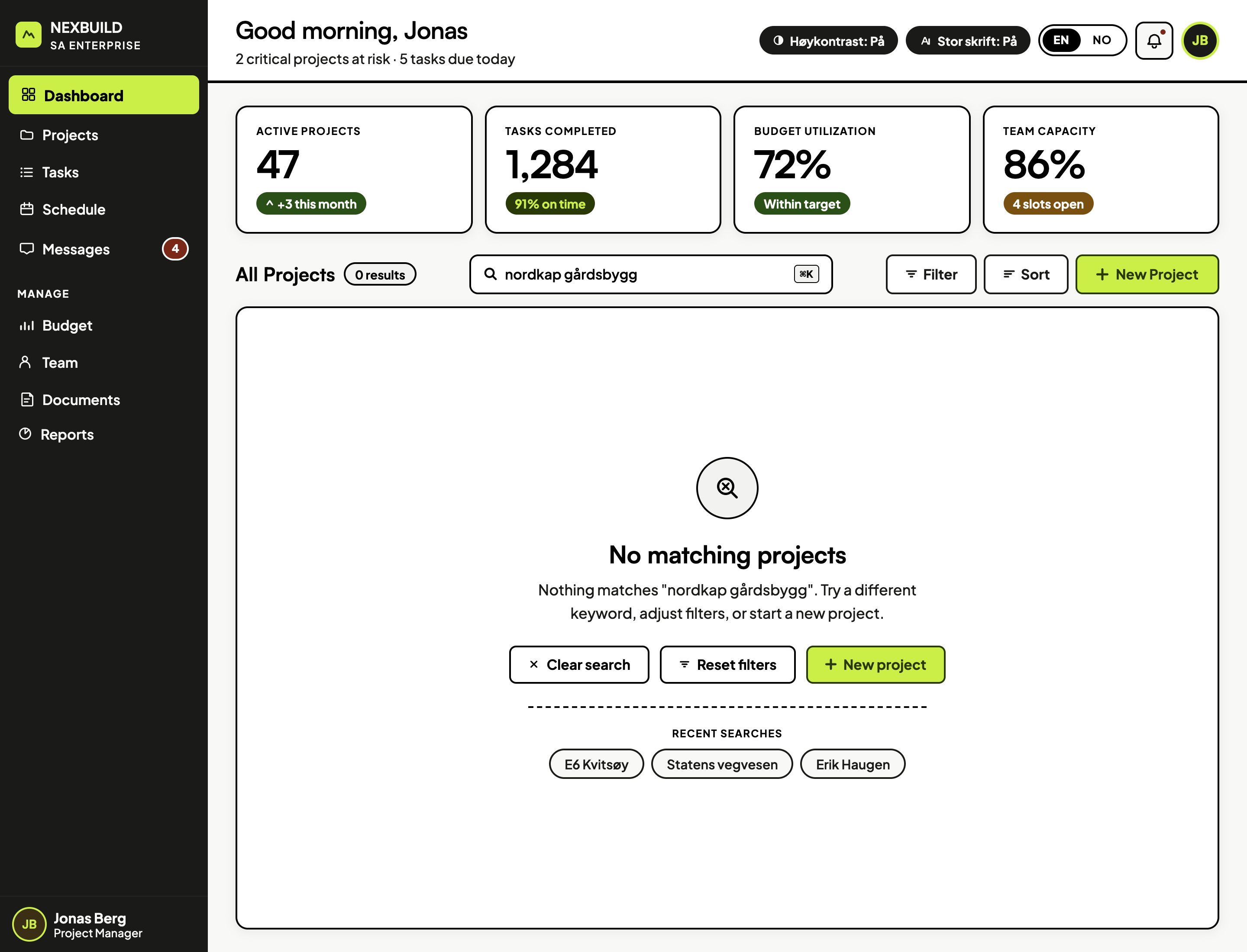
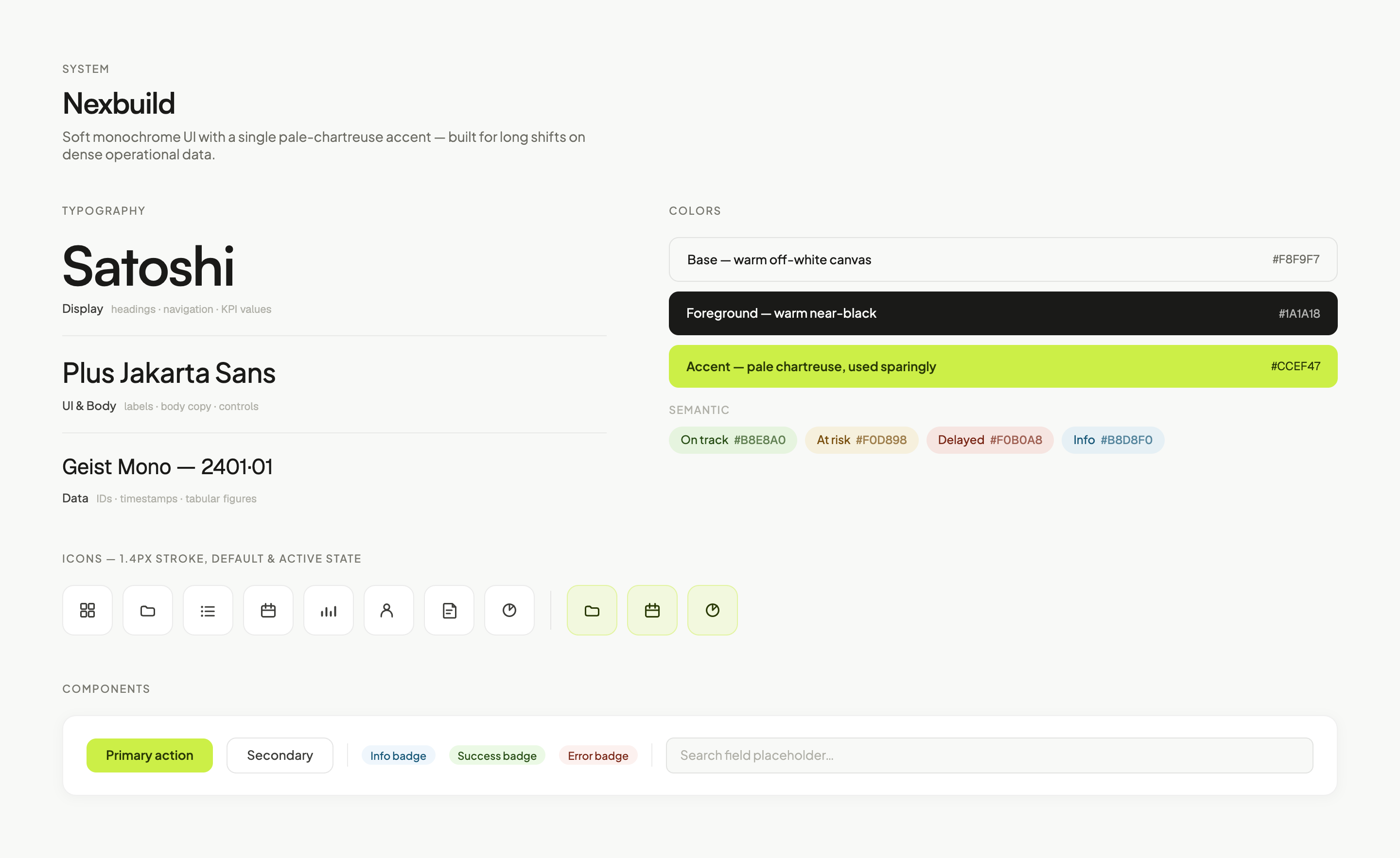
Soft monochrome UI with a single pale-chartreuse accent, built for long shifts on dense operational data - the visual language the redesign runs on.
This was meant to be a simple visual refresh. But you can't fix the surface without fixing what's underneath - so it grew into a new IA, a new design system, and real accessibility work. None of it was optional once I saw it up close. And it was never about cutting features - it was about redefining what each one was actually for.